Spring/Summer 2021

Schlicht Schön

Branding

About

SchlichtSchön by Rainer Böhm is a decor & interior store and decoration service, which opened in summer 2021, located in a former gas station from the 70s in the south of Austria.

The main aim of this project was to create a logo which can be used in various contexts, such as print or as a stamp.

First Drafts & Concept

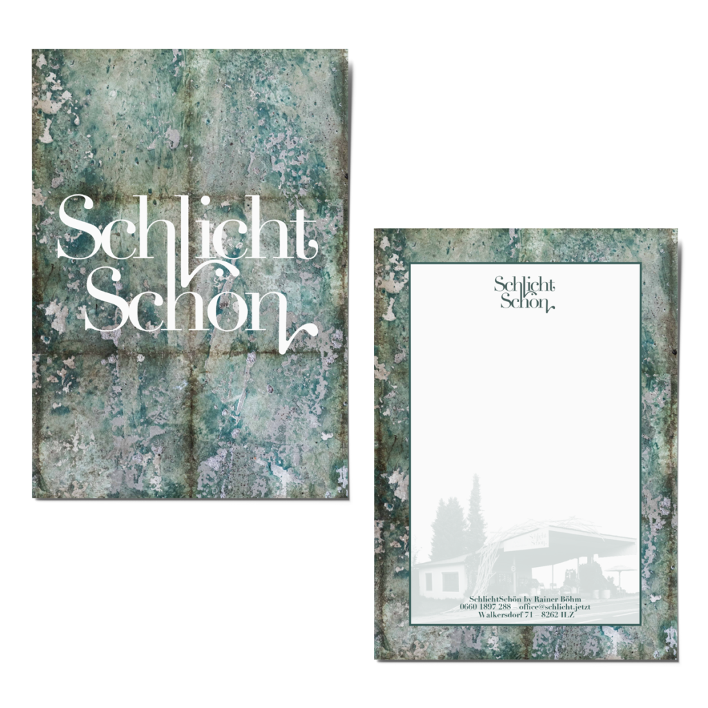
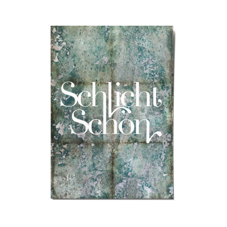
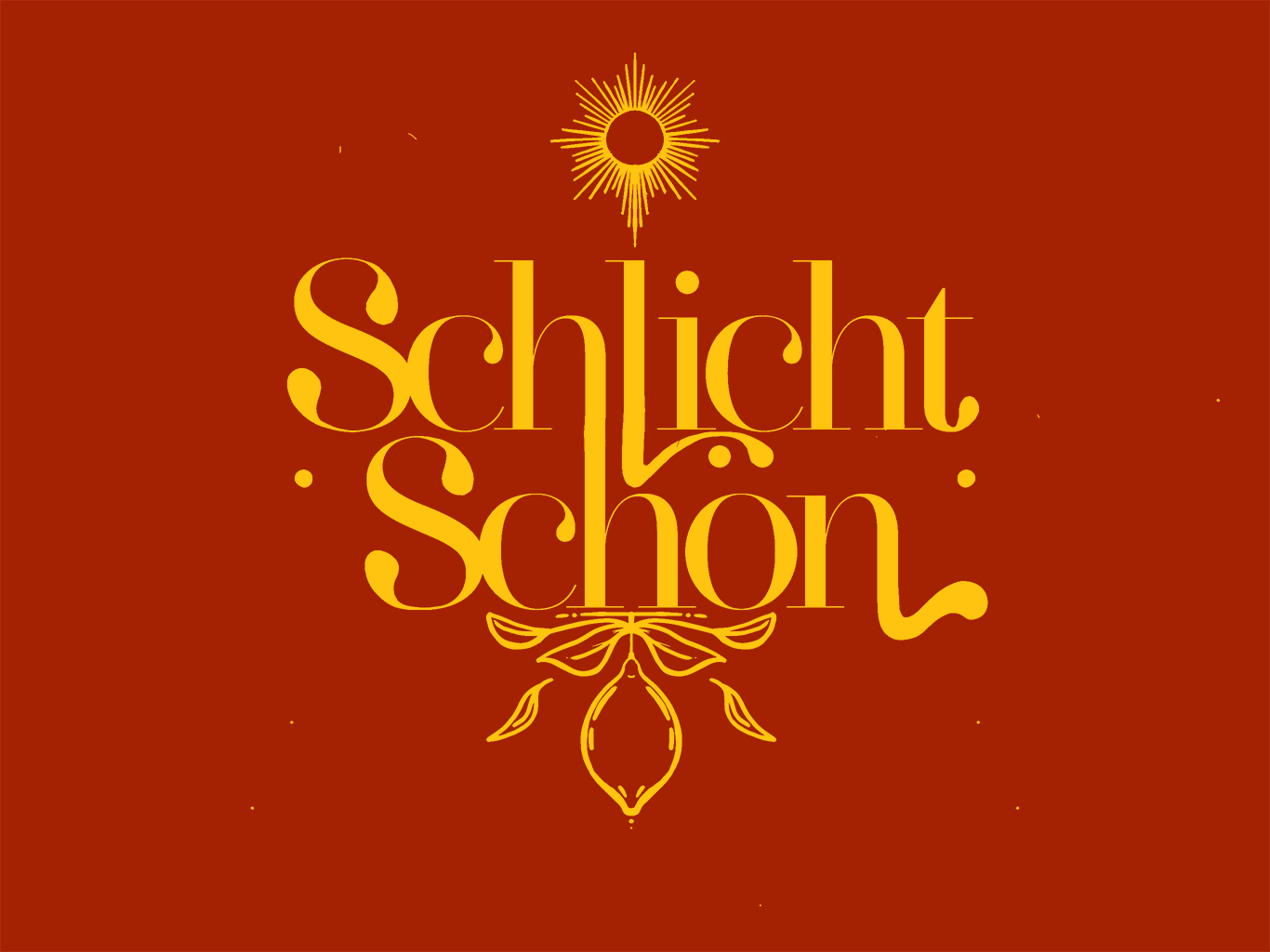
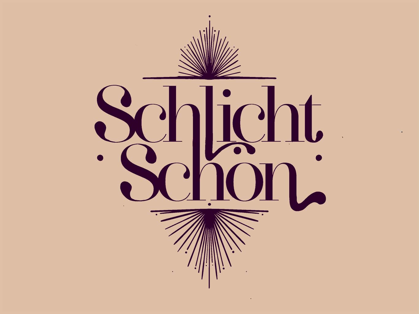
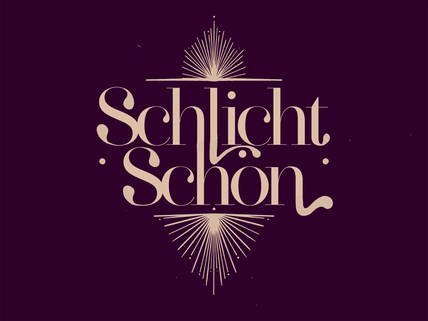
My first idea was a modular logo, consisting of a never changing word mark and, according to the season, some various elements framing the font. 

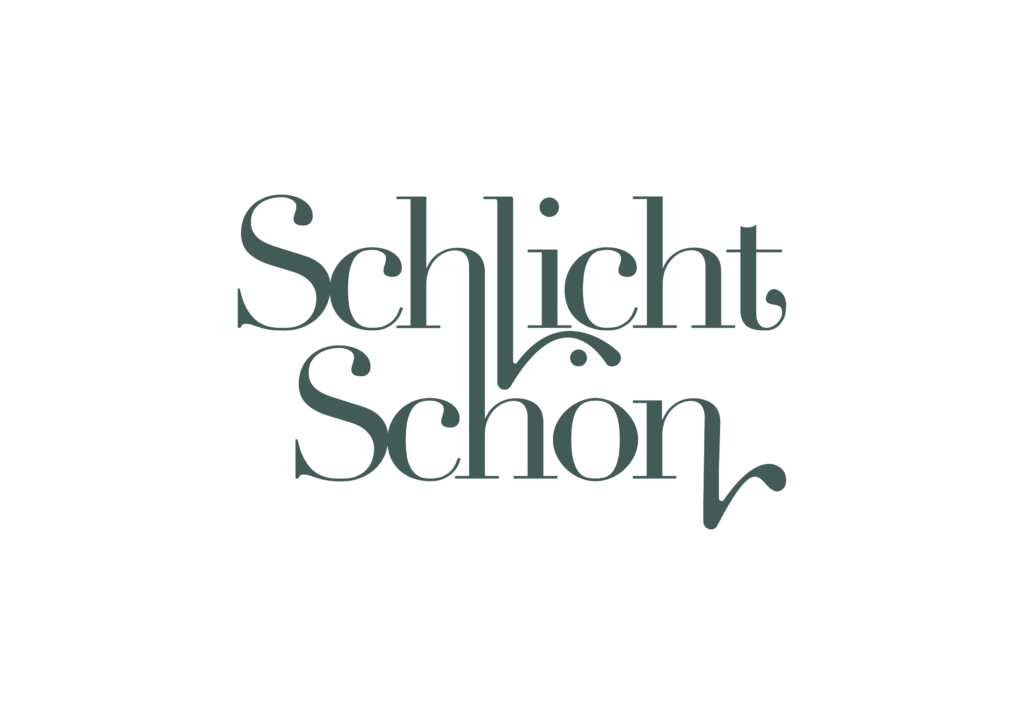
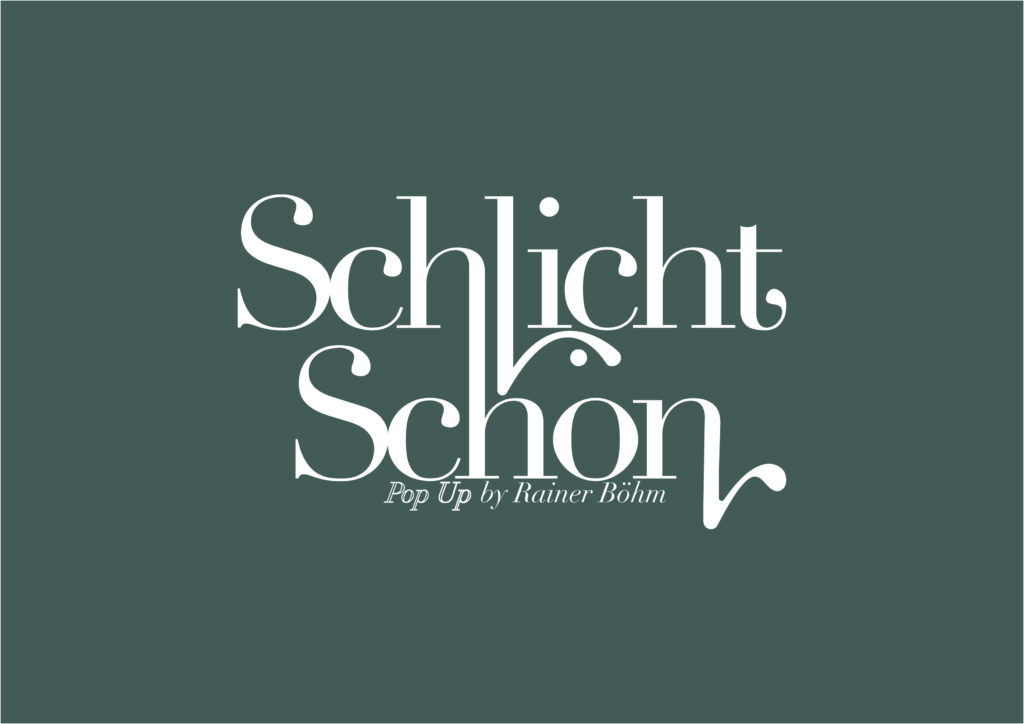
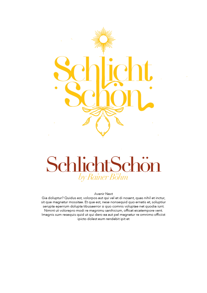
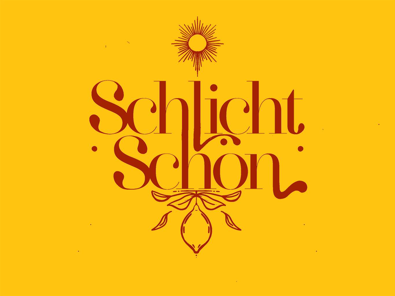
The main font for the Logo and Headings is Didot, whereas for the Logo I took it as a base and did some changes in the serifes by myself. 

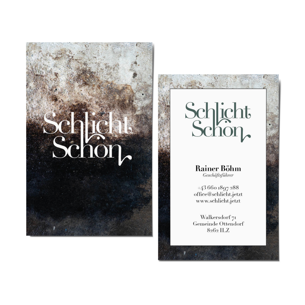
As my clients wish were multiple muted colors for his identity, I choose different ones for each variation

Why did I discard the idea?
Due to simplicity and economics. If the final version would be the modular logo, the client would have to order new businesscards, flyer, etc in each season and, if handled it accurately, he could not use last seasons. 

Final Version

For the final version, I choose to use an olive shaded green, which is based on the stores floor and to do more small changes in the font.

Print Products

For the design of the print products, I choose the shops floors as a background. The background of the multiple use flyer is the tile floor in the first room of the old gas station, in which the store is located in. On the back of the flyer, there is a lot of blank space, which is used for multiple purposes. 


The background of the businesscard is the oily floor of the second room, which Rainer, the shop owner, reglazed while he was renovating the gas station.
For the business card, we choose to emboss the logo with gold foil, as this look fits very well to the beige-brown background, and gives an elegant touch.